“Having a Website” Is Not Enough: 7 Common Mistakes That Kill Results
For many business owners, launching a website feels like ticking a box:
“I’ve got a website now, so customers will find me.”
But in reality, just having a website is not the same as having a website that works.
A site that looks “OK” but doesn’t bring in enquiries, bookings, or sales is simply another expense on your monthly bill.
In this article, we’ll walk through 7 common mistakes we see on small business websites, and how to fix them so your site actually supports your business goals.
1. No Clear Goal (Or Too Many Goals) on Each Page
If your homepage is trying to do everything at once — introduce your brand, list all services, show every project, tell your full story — chances are it’s not doing any of them well.
When visitors land on a page, they should understand within a few seconds:
-
Where am I?
-
What do they offer?
-
Is this for someone like me?
-
What should I do next?
How to fix it
-
Give each page one primary goal (e.g. request a quote, book an appointment, download a price list).
-
Make that action obvious with buttons like “Get a Free Quote”, “Book a Consultation”, or “Call Us”.
-
Remove elements that distract from that main goal, or move them further down the page.
2. Confusing Messaging: Visitors Can’t Tell What You Actually Do
A lot of websites lead with vague statements like “We deliver innovative solutions” or “We’re passionate about what we do”.
Nice words, but they don’t tell visitors what you actually offer.
If people have to scroll and guess to figure you out, many will simply hit the back button.
How to fix it
-
Add a clear headline at the top of your homepage:
“Web Design & Digital Marketing Studio in Hobart”
or
“Professional Websites for Tradies & Local Businesses”. -
Follow with one short sentence that explains the benefit:
“We design and build websites that help small businesses get more enquiries and bookings.” -
Use simple language your customers would use, not internal jargon or buzzwords.
3. No Clear Call to Action (CTA)
Even when a site looks good, often there is no obvious “next step” for the visitor.
They reach the bottom of the page and… there’s nowhere to go.
A strong website guides people forward, instead of leaving them to figure things out on their own.
How to fix it
-
Decide what you most want people to do: call, send an enquiry, fill a form, book online?
-
Place that CTA above the fold (visible without scrolling) and repeat it a few times naturally down the page.
-
Use action‑driven button labels: “Get a Quote”, “Book Now”, “Request a Call Back” — not just “Submit”.
4. Weak Mobile Experience
More than half of your visitors are likely browsing on their phones.
If your site is hard to read, buttons are tiny, or it loads slowly on mobile, people leave before they even see what you offer.
We still see many sites that technically “work” on mobile, but are frustrating to use: overlapping elements, text too small, menus hard to tap.
How to fix it
-
Design mobile‑first: check every key page on a real phone, not just a desktop preview.
-
Make sure headings, buttons, and form fields are large enough to tap comfortably.
-
Simplify layouts for smaller screens; one clear column is usually better than complex multi‑column grids on mobile.
5. No Trust Signals: You Look the Same as Everyone Else
If your website doesn’t show any social proof, visitors have no reason to trust you more than your competitors.
Common issues:
-
No testimonials or reviews.
-
No showcase of past projects or clients.
-
No mention of years of experience, certifications, or guarantees.
How to fix it
-
Add a “What Our Clients Say” section with 3–6 short, specific testimonials.
-
Show a handful of recent projects with a one‑sentence description of the problem and result.
-
Highlight trust markers: “20+ years’ experience”, “500+ projects delivered”, “Local Hobart team”, “Australian‑based support”.
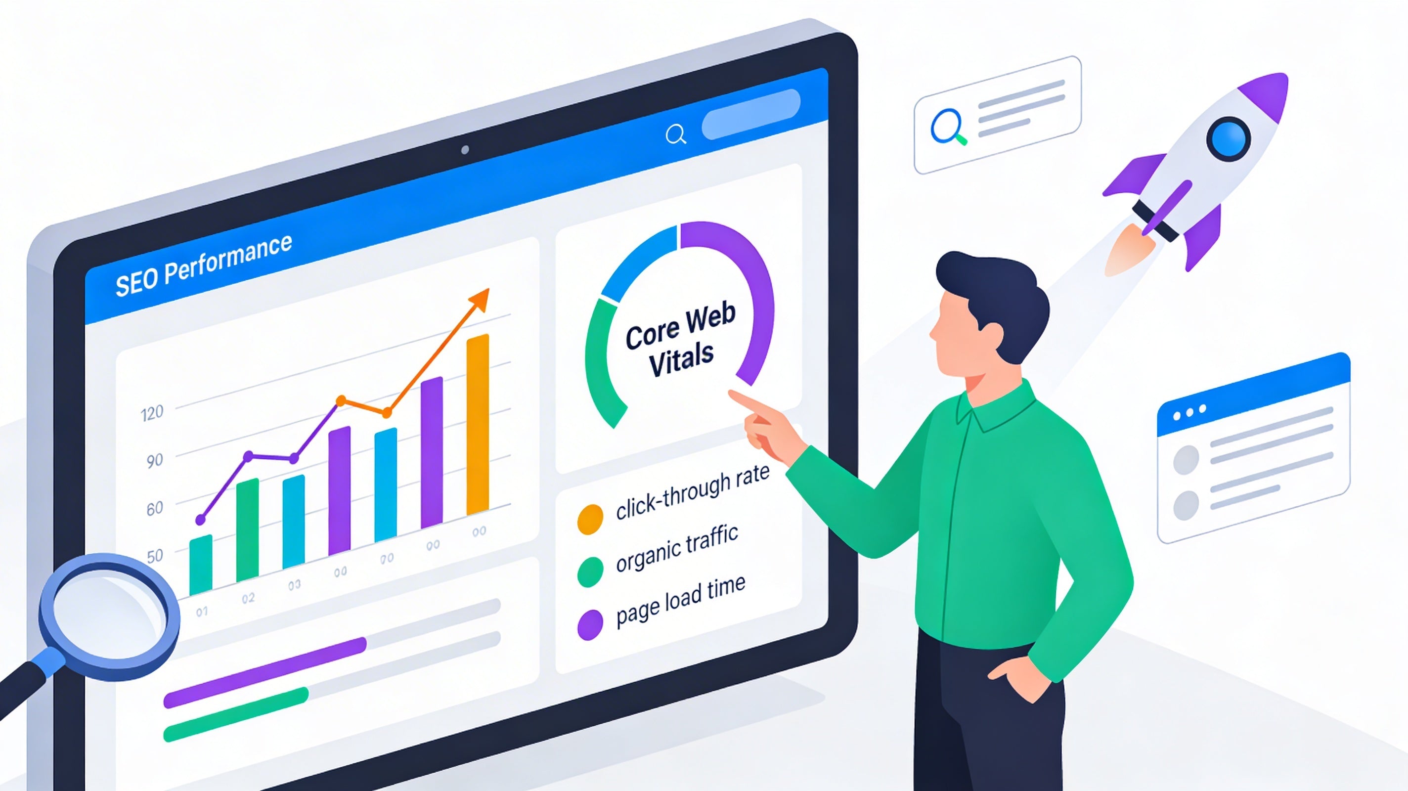
6. No Tracking or Data: You’re Driving Blind
Many small business websites have no analytics or conversion tracking installed.
That means you can’t answer basic questions like:
-
How many people visit my website each month?
-
Which pages do they spend time on?
-
Which forms or buttons actually generate enquiries?
Without this data, you’re guessing — and you can’t improve what you don’t measure.
How to fix it
-
Install a proper analytics tool (such as Google Analytics 4).
-
Set up conversion tracking for form submissions, phone clicks, and key buttons.
-
Check your stats regularly: which traffic sources bring enquiries, and which pages people drop off on.
7. “Set and Forget” Content: Outdated, Incomplete, or Irrelevant
A website isn’t a one‑time project; it’s a living asset.
But many sites are left untouched for years, which creates problems:
-
Old prices or services that you no longer offer.
-
Out‑of‑date photos that don’t reflect your current work.
-
No new content to help you rank in search results.
This not only hurts your credibility, it also tells search engines your site may no longer be relevant.
How to fix it
-
Review key pages at least once or twice a year: services, pricing, about, contact.
-
Remove anything that’s outdated or no longer correct.
-
Add fresh content that matches real customer questions — blog posts, FAQs, or case studies.
Turning Your Website into a Real Business Asset
If you recognised your own website in any of these mistakes, you’re not alone.
Most small businesses start with “just having a website”, and only later realise it isn’t bringing results.
The good news: you don’t always need a full rebuild. Often, clarifying your message, adding strong calls to action, improving mobile experience, and setting up tracking already makes a big difference.
At My IT Studio, we work with businesses who want more than a pretty site — they want a website that actually supports their sales, marketing, and operations.
If you’d like an honest review of your current site and practical suggestions for improvement, get in touch and we’ll be happy to help.
